


Redesigning a responsive website for a local business

Overview
Background
HI Leverage Financial is a business that specializes in creating customized cash value policies and providing personal financial guidance.
Problem
Their current website does not offer enough information about their product to convert their visitors to schedule a consultation.
Role:
Product Design Lead (UX/UI)
UX Researcher
Timeline:
~80 Hours (4 Weeks)
Tools Used:
Figma, Google Forms, InVision, Optimal Workshop, Squarespace
The Goal
Redesign their website and determine what features would motivate people to learn more about their product and ultimately book a consultation.
Competitor Analysis
My client recommended four competitors in their industry that had the content they wanted to include in their own website.
I did a competitor analysis to determine the features these websites included and discovered that the most common features were:
About page
Contact page
Financial questionnaire
Educational videos


User Survey
I discovered that not only do people read about financial services before booking a consultation, but they are also very likely to book an appointment through a website's booking feature.
I also learned that people prefer to watch videos and read articles when learning about financial strategies.
User Interviews
I interviewed HI Leverage Financial's clients to understand their experiences and motivations to book appointments.
Key Insights
Clients want a way to review topics discussed during their meetings.
Prospects don't schedule a consultation until they understand what HI Leverage Financial offers and how it can benefit them.
Sitemap
After learning that clients want a way to review the information they discuss in meetings, I added a resources section for them to refer to.
A major pain point was that people didn't understand what HI Leverage Financial does and if it's right for them so I added a FAQ section for prospects to get more information.
User Persona - Sarah
I noticed that HI Leverage Financial's younger clients were looking for different ways to invest their money but didn’t think they could invest through a cash value policy, so I created the “Financial Planner” persona to reflect this.
User Persona - Sean
I learned that their clients that bought a home and have children are concerned with leaving an inheritance for their families, so I created the “Investor” persona to reflect this.
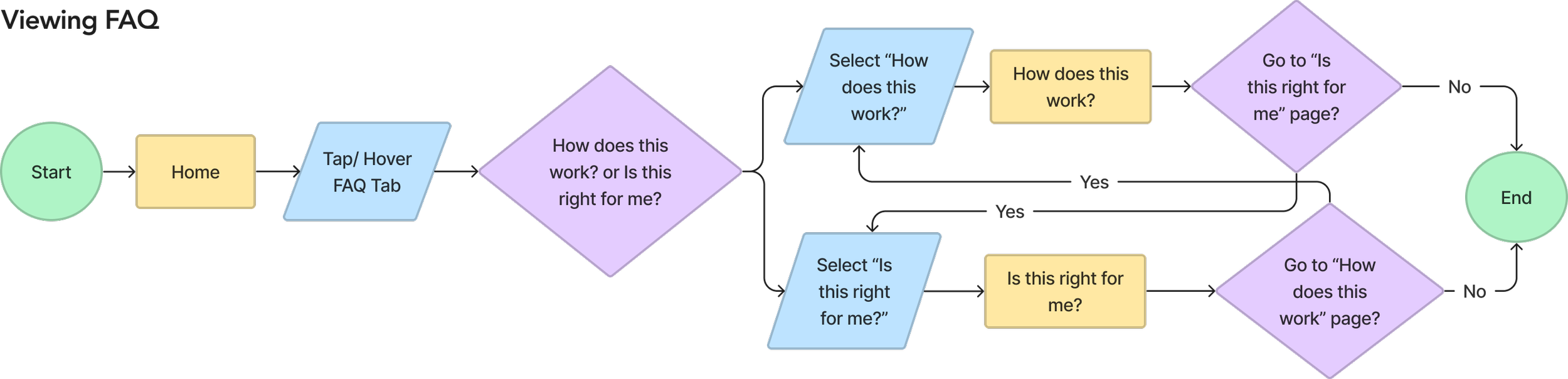
User Flows
Misunderstanding HI Leverage Financial’s product was a prevalent pain point that prevented people from scheduling a consultation so I created a user flow to visualize the user’s journey and ensure that they can easily find information about their product.
Their current clients want a way to review the information discussed in their meetings so I created a user flow for finding a video.

Wireframes (Desktop)
I wanted to highlight sections that would answer the two most prevalent questions that people had when first learning about HI Leverage Financial: what is their product and who should get their product.
Since my client would like their website to be built using Squarespace, I tried to design these wireframes with that constraint in mind.
This constraint heavily impacted my design decisions for the video library and video screens.
Wireframes (Mobile)
Since people will likely view the information from a variety of different devices, I created wireframes for a mobile device to ensure the design is responsive.
I considered how Squarespace executes responsive design and how certain elements would look when using their sitebuilder.
Branding & UI Kit
My client requested various shades of blue in their color palette to instill trust and calmness in their brand. To ensure a clean look to match the color palette, I chose the font Avenir.
After defining the brand, I assembled a UI kit with the components that are most frequently used on the key screens.


High Fidelity Prototype
Home

Video Category & Video


Product Information


Mobile Versions


Usability Testing
I recruited clients and prospects for usability testing because I wanted to determine whether current clients could find the resources they need and if prospects were given enough information to incentivize them to book a call.
Results
Participants were unsure where to go when asked to find more details about a cash value policy.
It wasn’t clear to participants what each navigation item would contain.
Card Sort
After understanding that users had difficulty navigating the site, I wanted to improve discoverability and created a card sort to understand how people would group the website content.
Results
Adding a category labeled, “Our Product” helps users discover more information about a cash value policy.
The questionnaire and retirement calculator would be more discoverable under home and resources.
Revised Sitemap
Before jumping into my design iterations, I wanted to apply the results from my card sort and restructure the information architecture of the site.
Since the Specialties tab discussed applications of their product, I replaced the “FAQ” and “Specialties” tabs with “Our Product”.
Here, users can then find information on what their product is, what it’s used for and who should get it.
In the user interviews, all participants mentioned that the retirement calculator and questionnaire are useful resources so I added it on the home page and under the Resources tab.
Revisions
Homepage Revisions


Navigation Revisions

Added Page to Explain What Their Product Is Used For


Footer Revision

Final Prototype
I wanted to ensure that this website is a useful solution for prospects initially discovering HI Leverage Financial’s product so it was crucial for me to understand how users would organize the website content in order to improve navigation and discoverability.
After applying the insights from my usability test results and card sort, I designed my final prototype.

What I Learned
Communication
I learned how to communicate with a stakeholder to fully understand their business goals and what success would look like for their website. When presenting the initial designs to my client, they specified that they preferred to define their product as a “Cash Value Policy”. After my usability tests, I discovered that users aren’t familiar with this term and this presented a unique design challenge to structure the information architecture in a way that allows users to easily find and learn more about their product.
To ensure that we are designing a useful and intuitive site for their clients and prospects, I scheduled meetings with my client to present my research findings so I could explain my design decisions and advocate for the user. Throughout this process, I was able to understand how to balance business and user goals while also considering constraints such as timeline and how the site would be built.
Usability Test Plan
I learned how important it is clearly define the tasks that users will be testing. The first task in my usability test asked participants to find a video titled, “Driving Your Future”. Being specific on the title of the video that they were tasked to find may have impacted the results. Alternatively, if I just asked them to find a video, that may have influenced where they would navigate to first.
Next Steps
Design remaining pages
I would like to create the wireframe for the “About Us” page and include it in the prototype prior to my second round of usability testing to determine if the structure and layout of the content is easily understandable for users.
Since my client would like to build their site using Squarespace, this applied a design constraint limiting the blog and video pages to Squarespace’s templates.
Usability Testing
Prior to building the site on Squarespace, I would like to conduct an additional round of usability tests to determine the success of the revised sitemap. The insights from the second round of testing will be very useful in understanding if navigation and discoverability improved.